Interactive Expiration Calendar for finding/viewing dates by type
Interactive Calendar
The marketing organization printed and sent thousands of options expiration calendars evert year. They’d create a date spec in excel, have them audited by email, create a PDF, and send them off to a print shop. A PDF was then posted to the site. As stagnant as this was, it was still a highly visited page and referenced link. The whole endeavor cost roughly 300k a year. I researched the current process, wrote up MVP and stretch requirements, and created the first low fidelity Wireframe for testing. Once that passed, my designer took over to refine and add the appropriate UX. While I worked on streamlining the maintenance and auditing process. Reducing risk and increasing speed. In addition, the calendar was built to scale to include other financial asset dates in the future.
Color Room Management
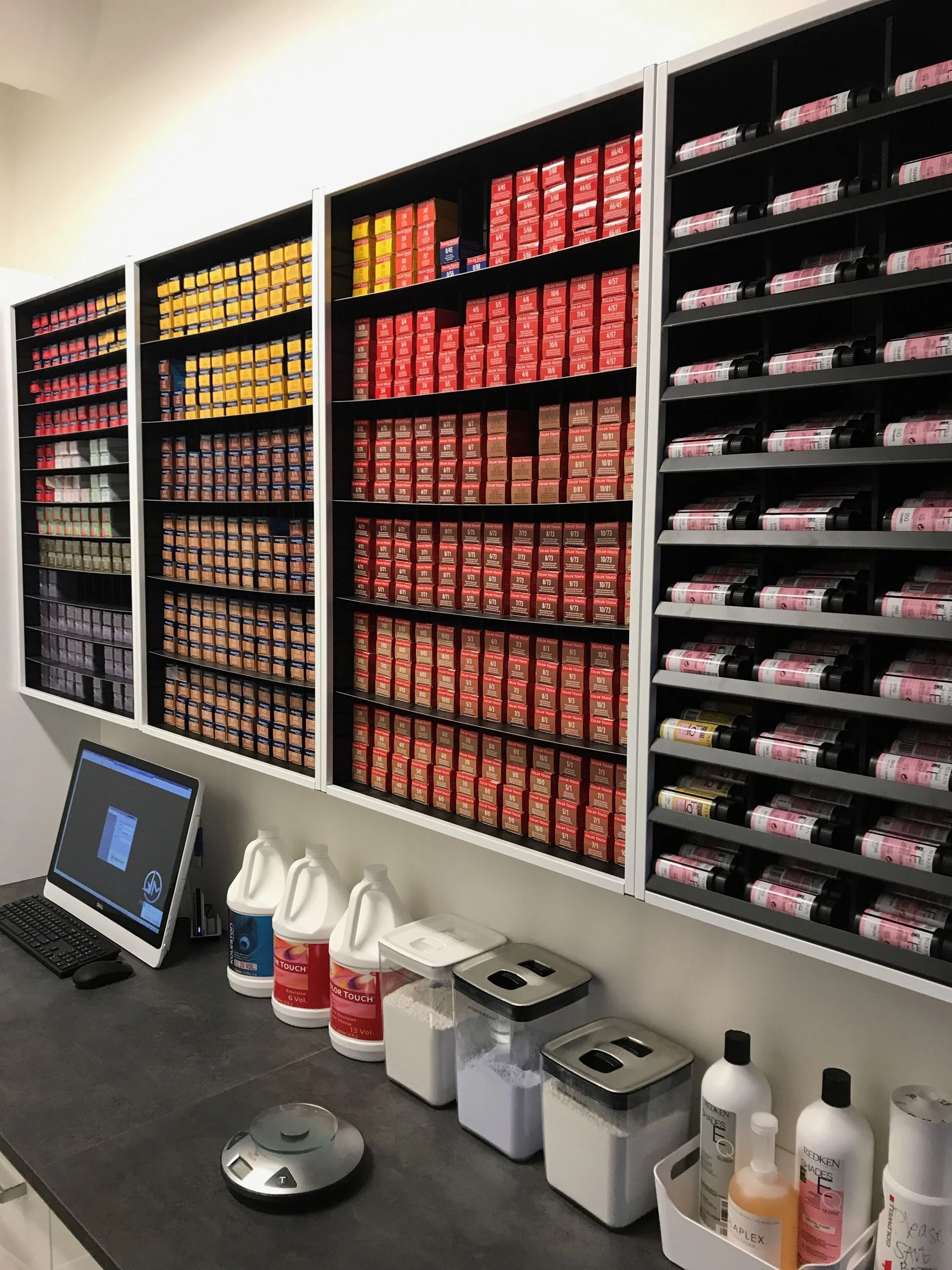
I took on the task of evaluating and redesigning a color management software platform that, while up and running, was having issues gaining traction within salons, even though the technology when used, was proven to positively impact bottom lines. The current platform was split up into 3 components: a digital scale, an app, and a website (for management and reporting). I evaluated the overall experience and recommended some simple changes to forms, inputs, and placement for best practices. I then set about visiting salons that both currently used the platform and those who didn’t (I wanted to see the ‘delta’ in behavioral changes) . I was able to observe that for many people, the sequence of the screens, and some of the interactions within those screens, didn’t match the “natural” mini movements of the colorist. In fact some aspects were looked at as impediments, and were skipped or maneuvered around which degraded some of the data being collected. We were operating on a constrained technology stack, so I implemented some of the changes I could immediately, which reduced some task times by 50%. I used the rest of the information to create rough wire frames of a “next generation” platform, with a better mobile app experience, that pushed some tasks up pre-color room, surfaced up needed information smartly, reconfigured some data on the backend and created incentives for colorists following the system.

Adventure Sport and Social
While at Vokal, we were approached by some adventure sport enthusiasts who wanted to build a web site and app that could inspire, build an adventure sport community, and attract known personalities in these sports. They had a current site that was heavy on content (blogs, images) and reviews. I dove into the industry; gathering inspiration from other athletic sites, small organic travel blogs with strong followings and the founders themselves. In addition I read up on the psychology of community building including on social media, clubs and gangs. I did some quick and dirty interviews with 3 adventure sport enthusiasts (climbing, ulta-long distance hiking and SCUBA). I paired with a UX designer to create an experience that relied heavily on dramatic but personal imagery, had custom badges and experience levels using industry terms for each kind of sport, and a unique social component where users could use a map to locate places to climb or ski and find the profiles of locals who knew the areas and could give advice and could even be available to join on excursions.

